Via Rail App Redesign
Goal
Redesign the Via Rail App to encourage easy ticket booking and tracking.
Duration
6 months
Role
Product Designer
Responsibility
Redesign the entire app
Tools
Sketch | Procreate
Invision | Keynote
Background
I take the Via Rail train, Canada’s largest passenger rail service, every weekend to visit a small town named Kingston. Even though I love taking the train, it takes forever to find my e-ticket or to check the train status on the app. I redesigned the Via Rail app because I think passengers deserve a way to access their trip easily and quickly after long day.
Challenge
The Via Rail app is supposed to be a convenient way to book trips, pull up tickets, and check your train status. However, there is a lot of unnecessary clutter and extra steps on the user journey that impact the ability of commuters to access their trip. The challenge is to provide a clear and robust journey for busy people to access their trip easily and quickly.
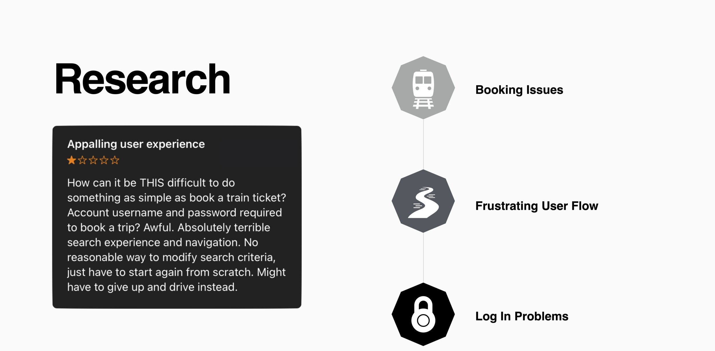
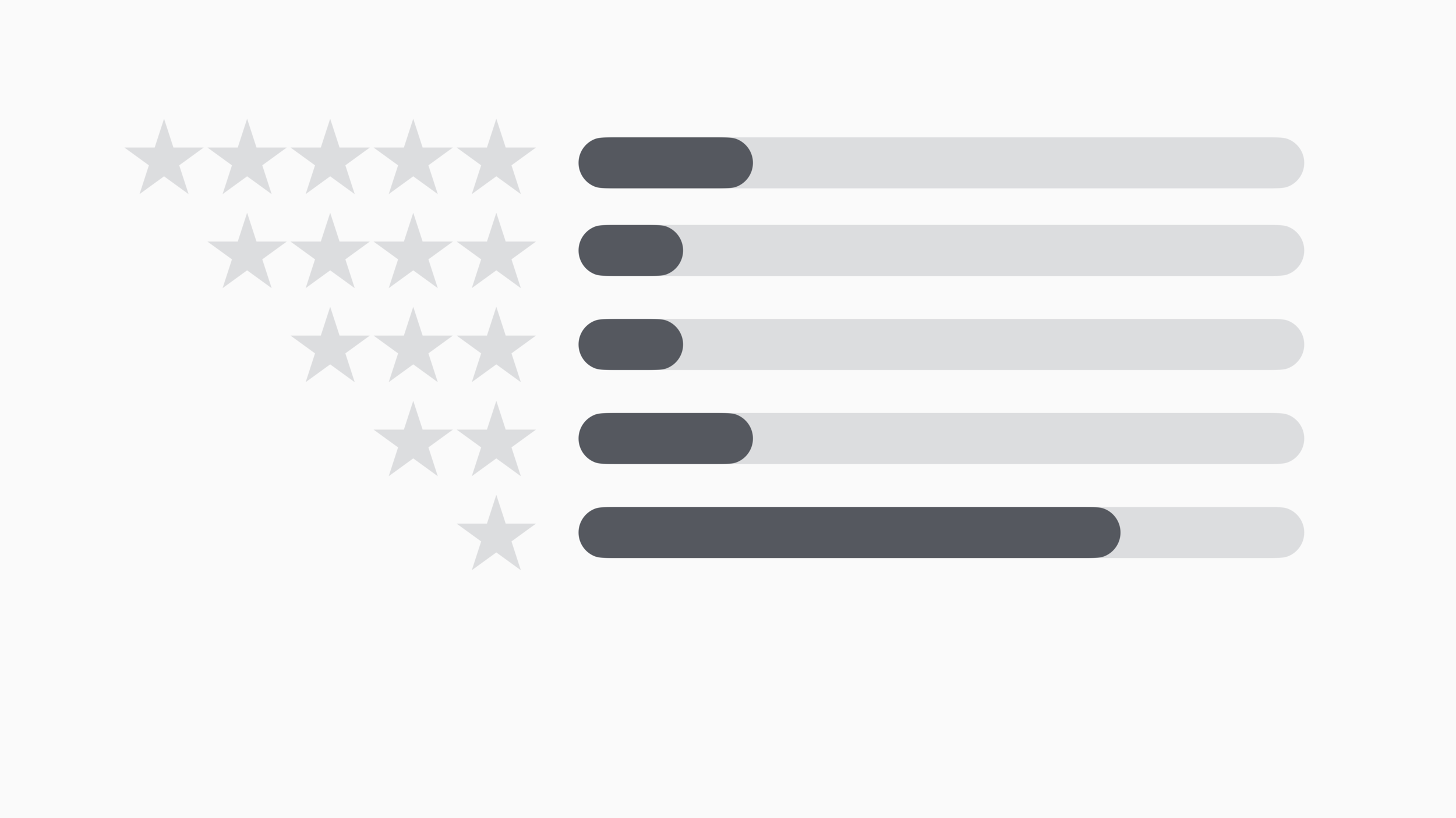
App Store Reviews: 365
Average Rating: 2/5
32% of users experienced booking issues
35% of users frustrated with the user flow
12% of users could not log in
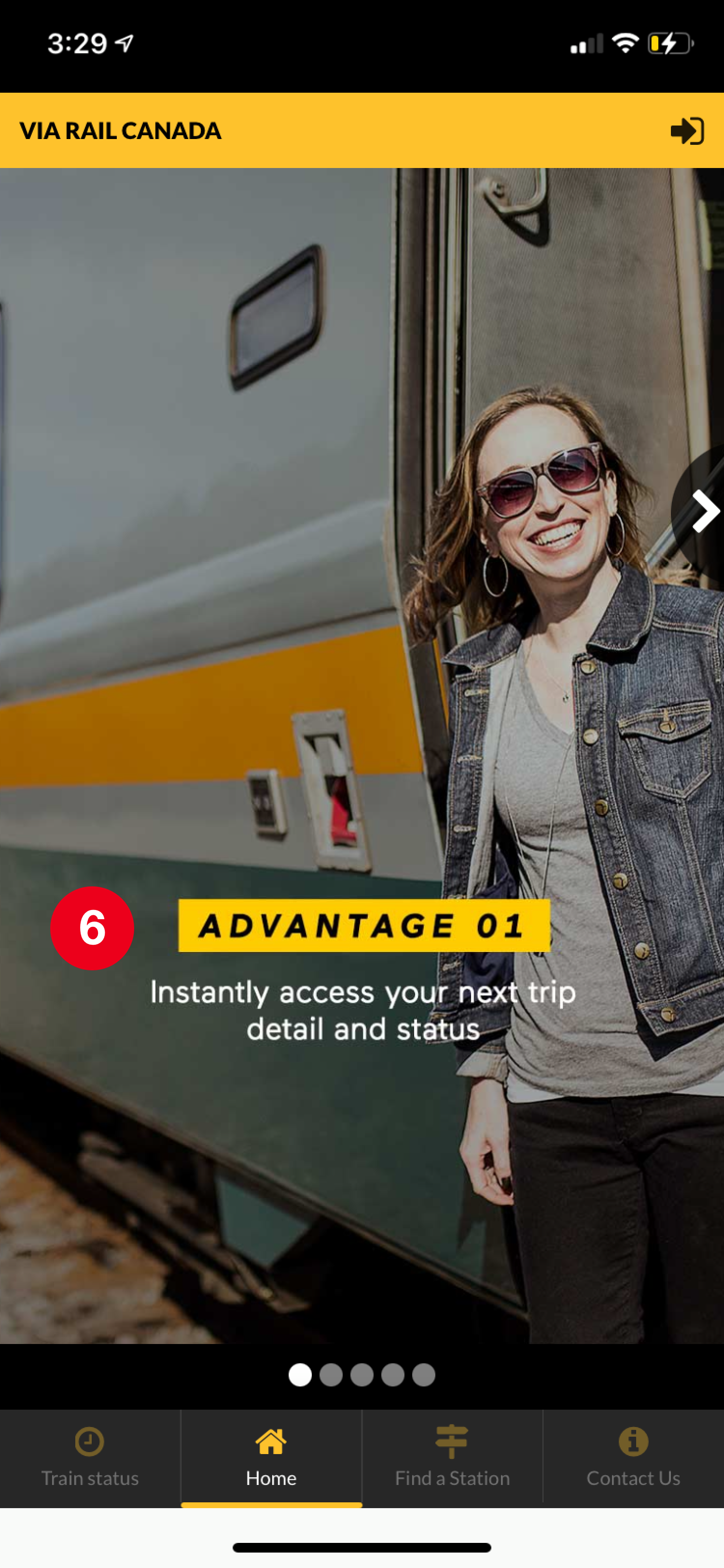
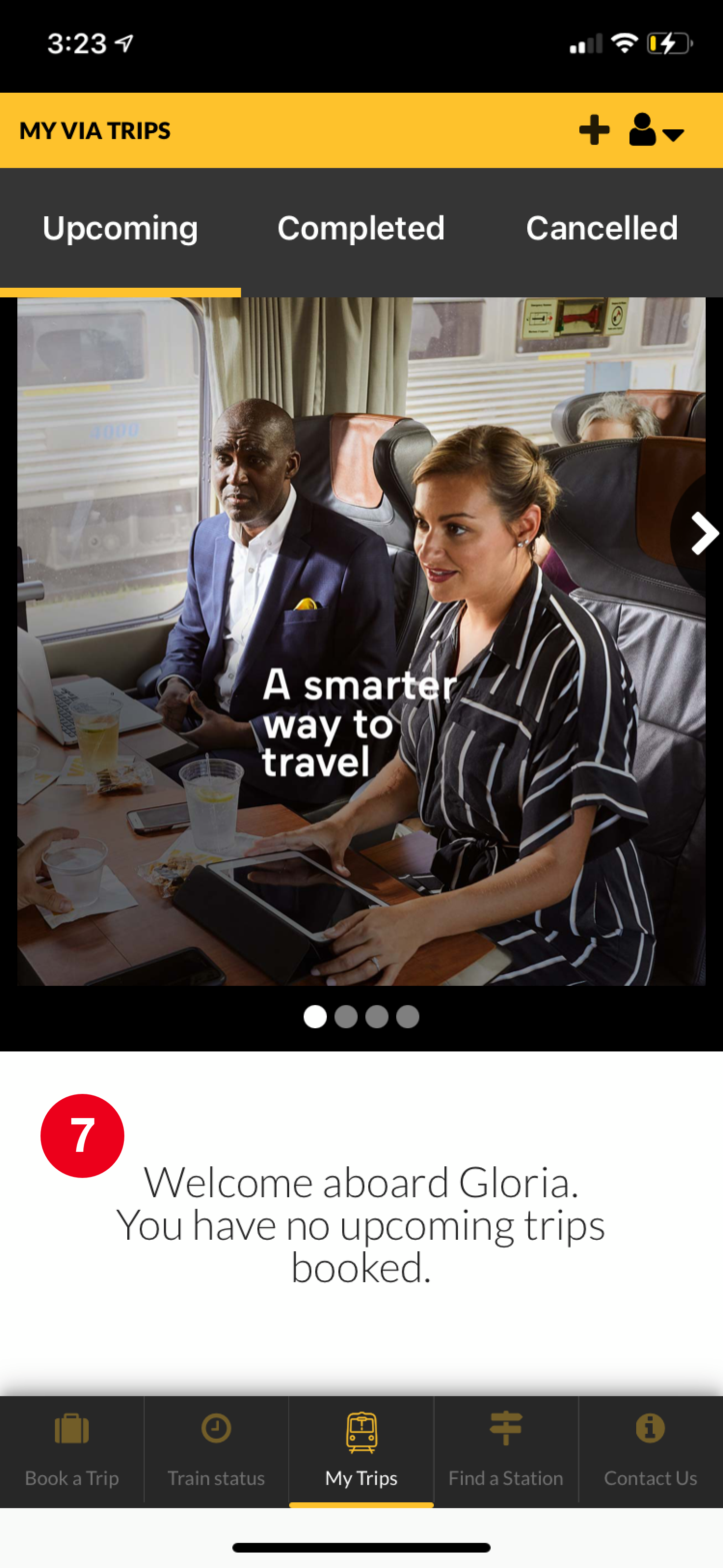
Original App Screens
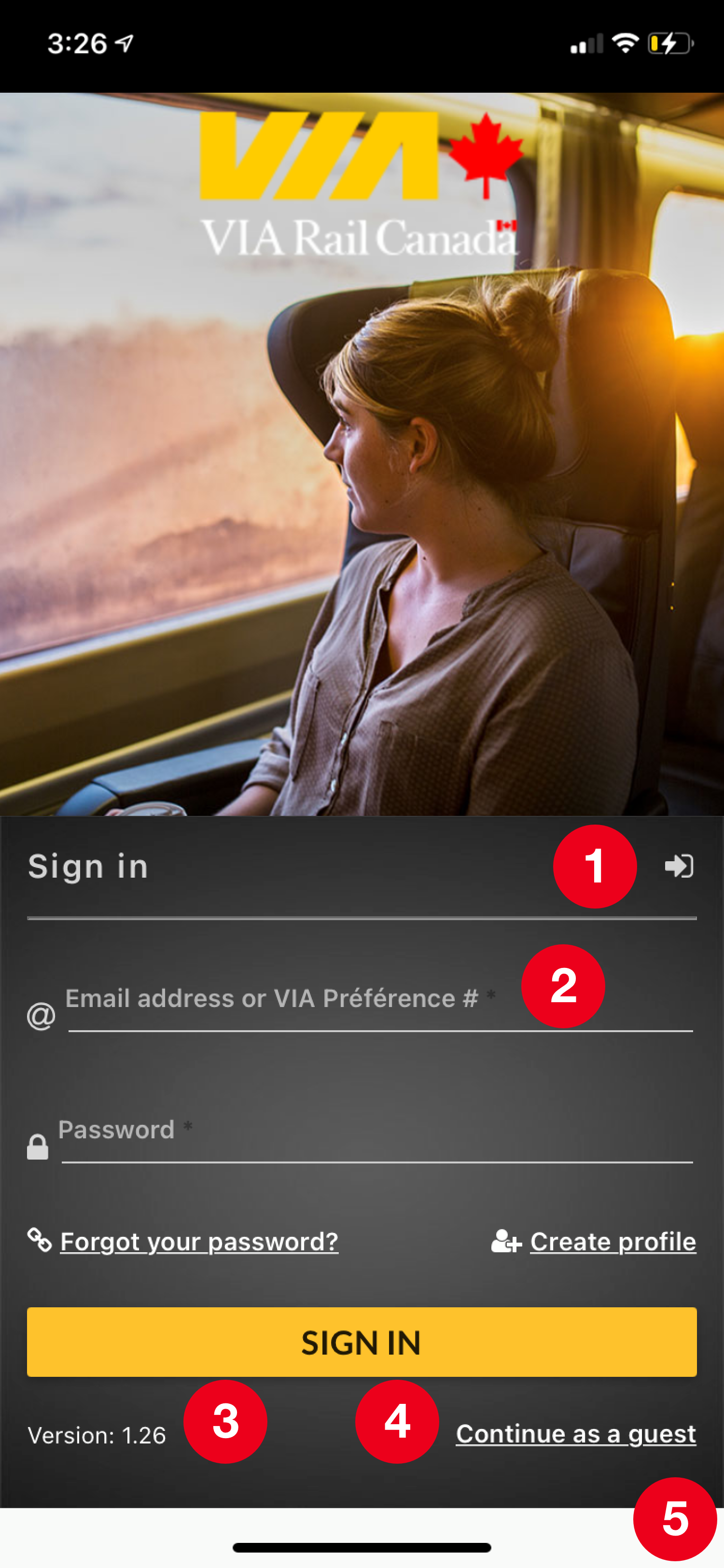
Major issues
1. Redundant call-to-actions
2. Multiple username entries
3. Misuse of version labels
4. Non-account holders need to search for CTA
5. Incorrect dimensions
6. Home screen does not incentivize users to purchase tickets
7. Unnecessary versions of the home screen: account holders & guests
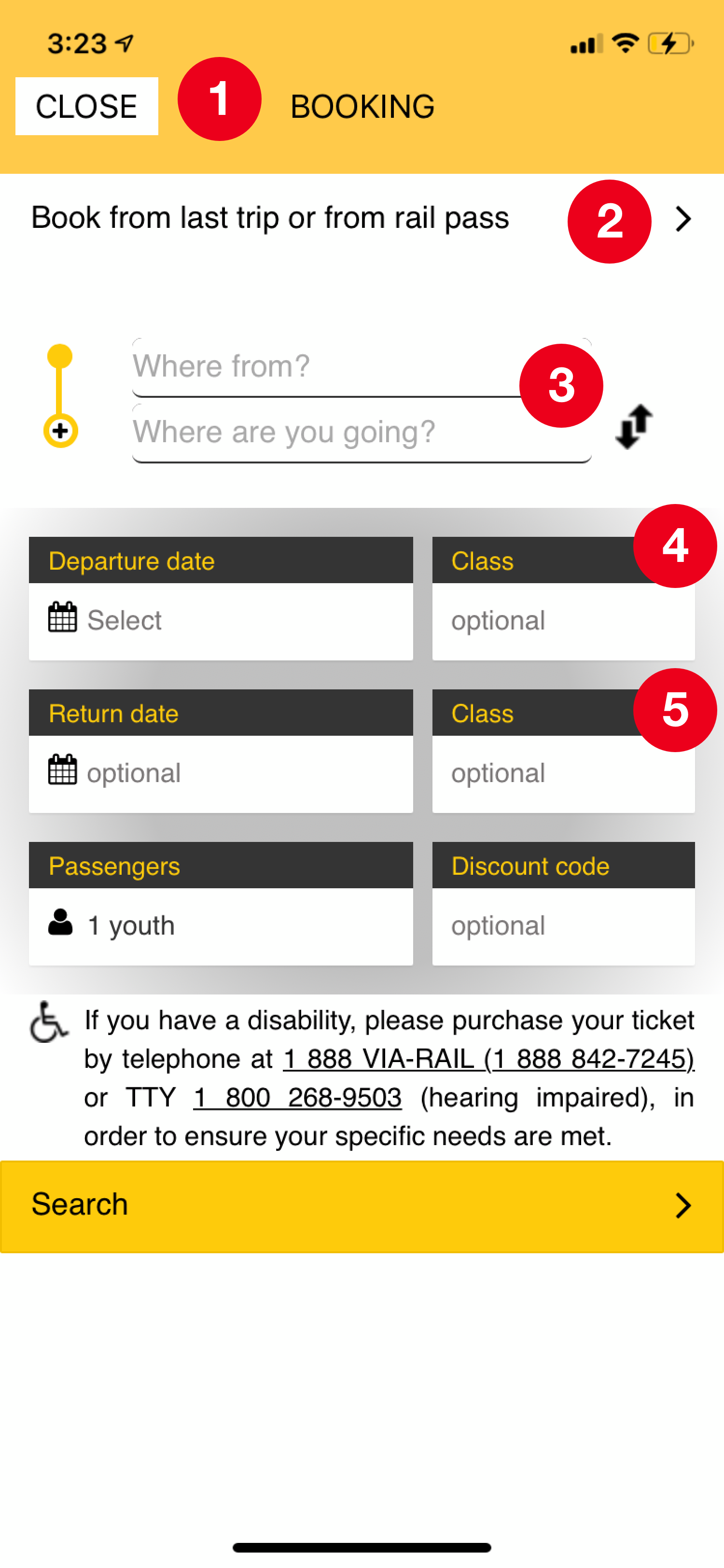
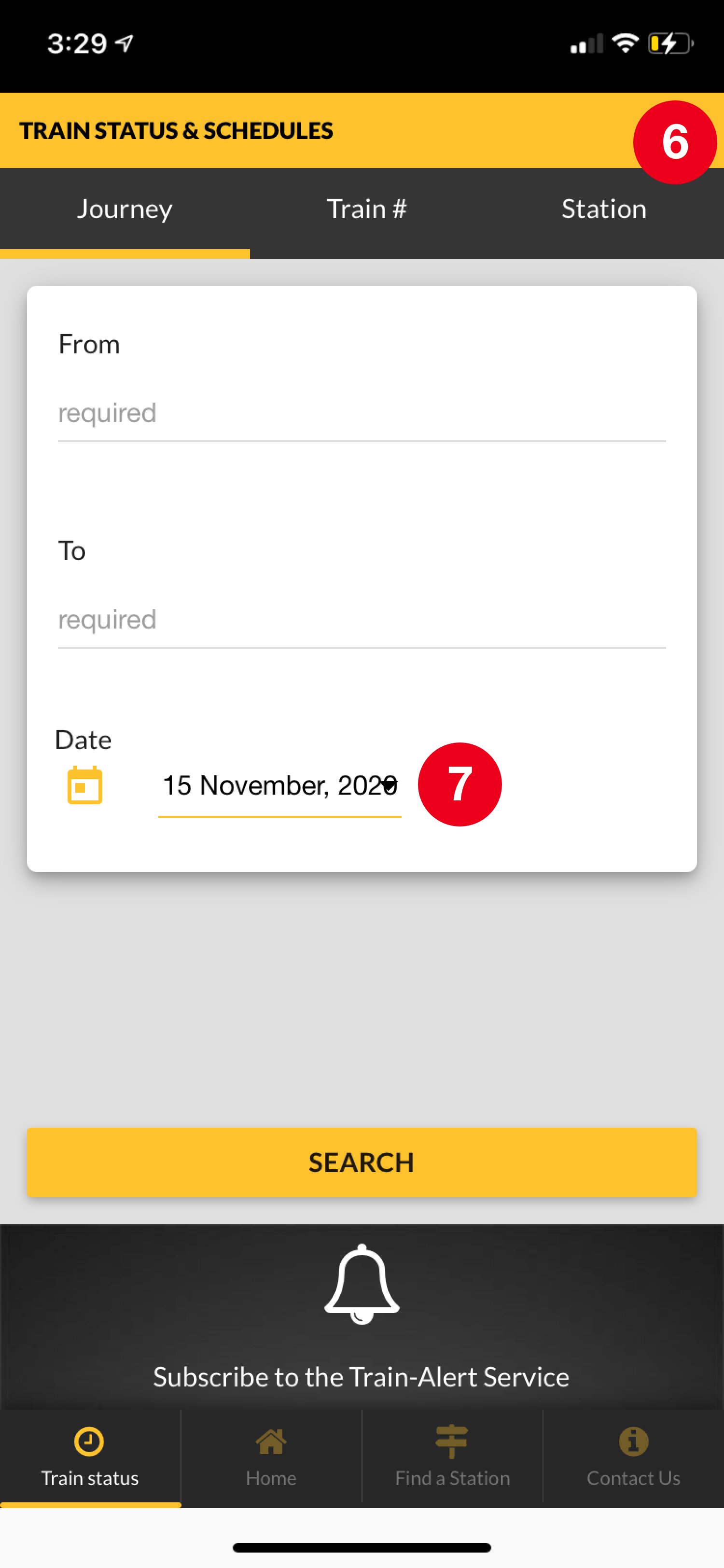
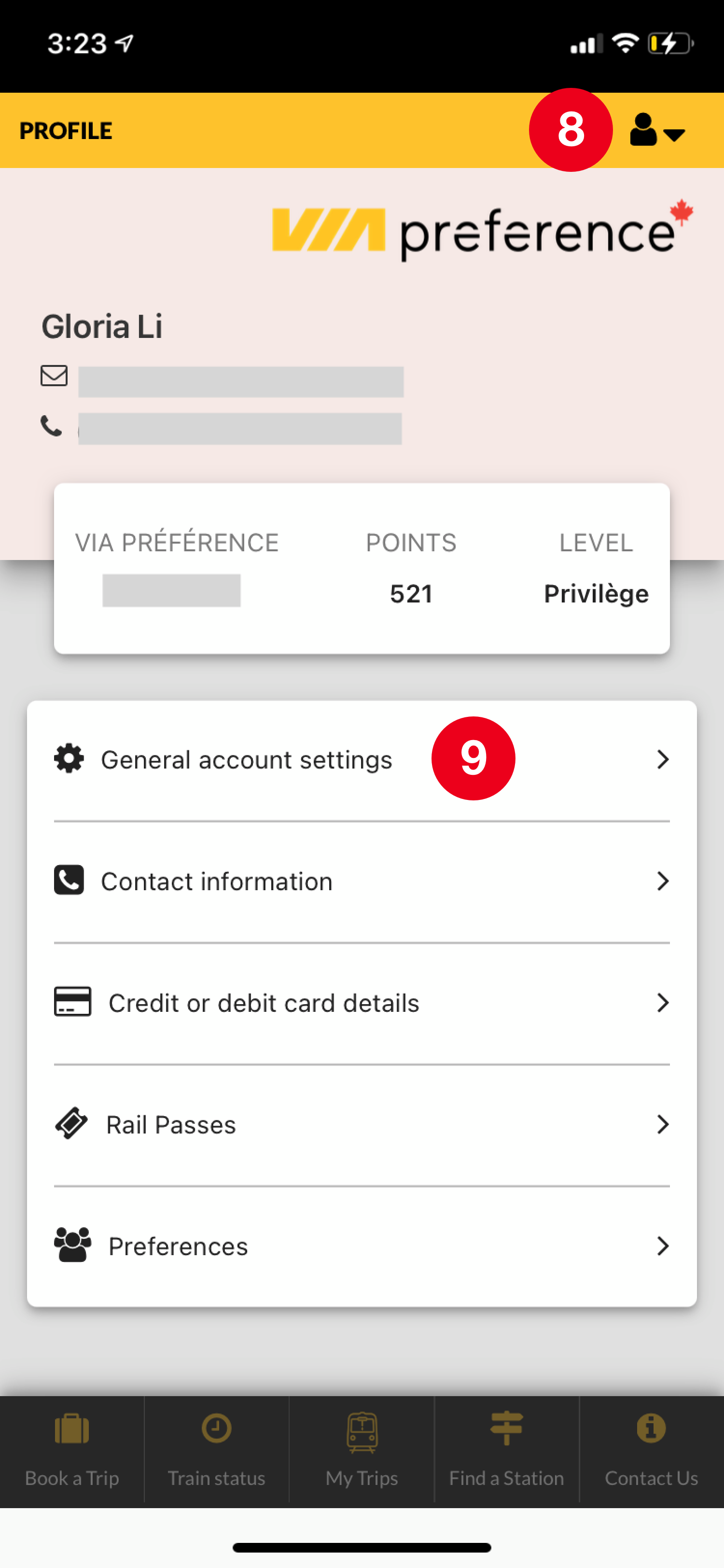
Major issues
1. Poor accessibility: redirects to new window
2. Extra information: most users will not use
3. Inconsistent grammar: Where from? Where to?
4. Convoluted digital hierarchy: fields are not organized by necessity
5. Redundant elements: reselected in ticket selection page
6. Overwhelming & manual: search each time
7. Overlapping UI elements: Dropdown arrow misaligned
8. Hidden important feature: Profile settings
9. No logical hierarchy: Account settings embedded in profile settings
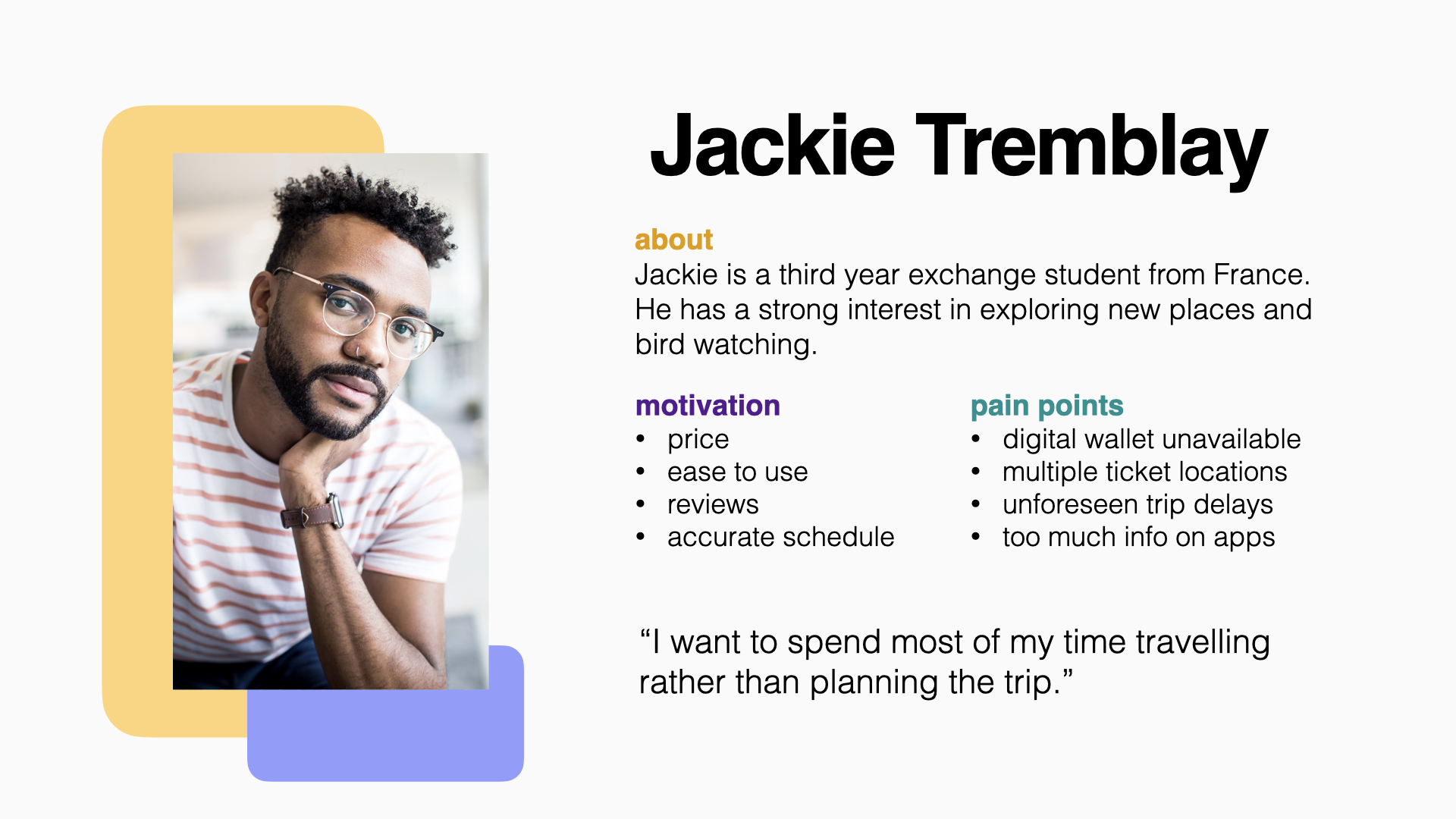
Users & Audience
The target audience are travellers who take the rail service to reach far out destinations between major cities. The travellers include students, families, business professionals, seniors, international visitors and weekend trippers.
Low Fidelity Prototype
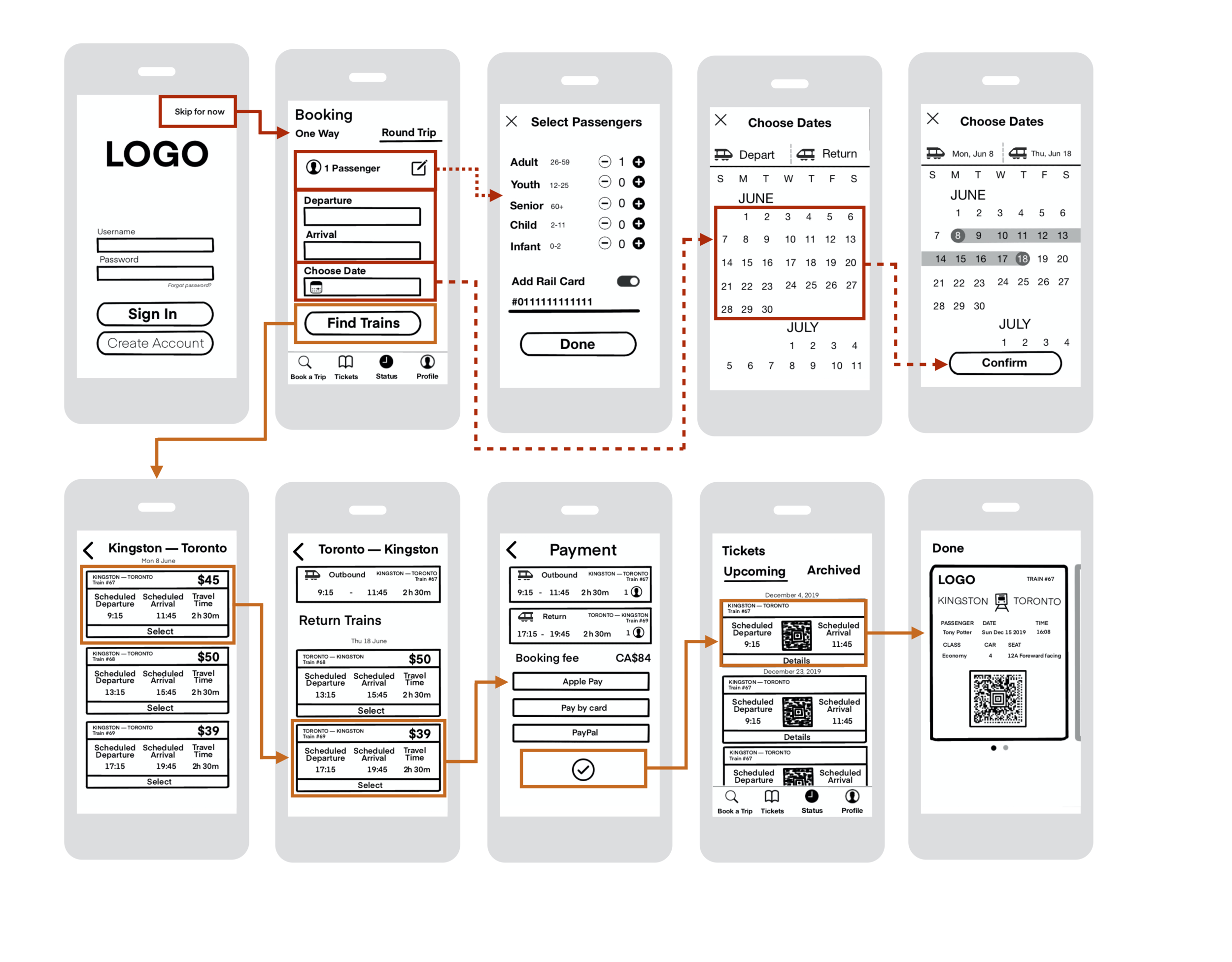
Problem: Streamline user flow to purchase a train ticket without getting distracted by the little details.
Solution: Drew rough draft and outline only the relevant call-to-actions.
Impact: Distill design to the most important UX steps.
Tools: Procreate & Keynote.
Reflection: What I learned?
Technical
Tools:


Problem: How do I gain a deep understanding of relevant design applications in order to make an effective app redesign?
Solution: I spent two months at the beginning of the project taking LinkedIn tutorial classes and YouTube tutorials to gain a deeper understanding of the applications used for app design. I followed some examples then I used the skills I’ve learned from various lessons and applied them to the Via Rail app redesign.
Impact: I’ve learned many important tools that help designers build better UX and UI for users. I have used this understanding to become better at my role as a digital content lead when working with other designers. Deeply understanding these tools has allowed me to gauge more efficient solutions and provide effective recommendations to solving design problems.
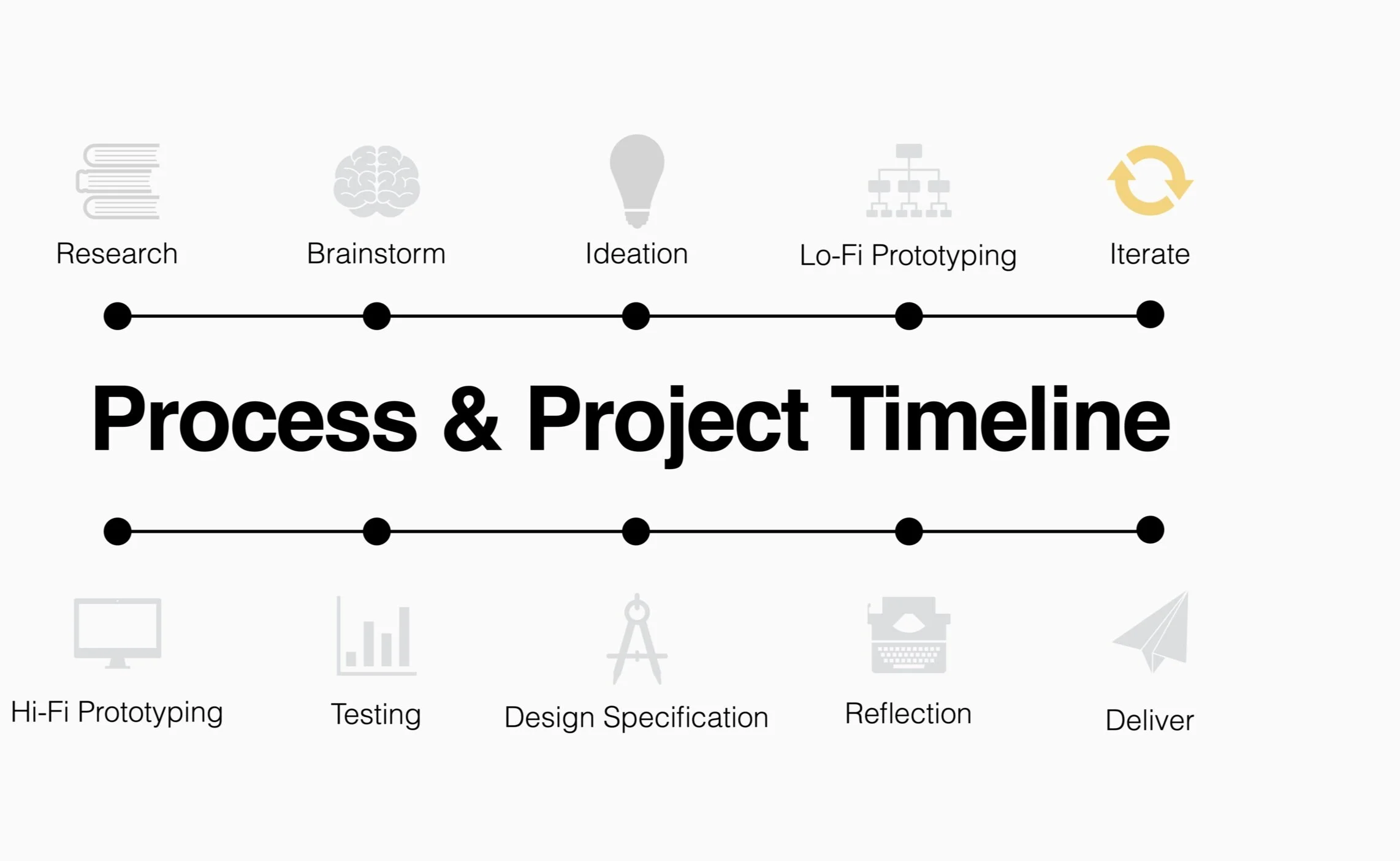
Process:

Problem: Why is a design process important?
Solution: I’ve learned that it’s important to have a design process because it allows me to be efficient and transparent when designing an app. My design process is a bit different than when I work with clients because the feedback is not coming from a customer, but rather from peer reviews. Learning this design process has helped me understand how to maximize my time and set a direction early on.
Impact: Deeply understanding the design process has allowed me to be more transparent about my design and communicate my decisions in a coherent and justified manner.
UI Graphics:


Problem: What problem was encountered when experimenting with UI elements? How can UI affect usability?
Solution: I struggled with UI because every piece of information needed to match the theme. Most often, when one element changes — it’ll impact other elements with it. For example, the colour of a button not only impacts the enabled state but also the disabled and ghost states. This is significant because it affects the cohesiveness of the composition which leads to effective usability.
Impact: I’ve learned not to look at elements and design as individual pieces, but rather pieces of a whole. Understanding the bigger picture helps me identify what is important and why we add or remove certain elements to better usability.
4 Major lessons
Justifying Design Decisions: Every decision no matter big or small including additions and even removals should be justified.
Low fidelity: Focusing on visual details is not useful for low fidelity. The content transcends aesthetics at this stage.
Empathy: Designs need to ultimately aim to help people improve their lives. The high fidelity prototyping stage was difficult because I admired the new trend of Neumorphism. I tried this style out on my redesign, but eventually I found out this is not great for accessibility due to the low colour contrast in the shadows. Ultimately, I decided to go with the more accessible option.
Iterate, iterate, & iterate: No one ever expects to iterate so much.
It’s so hard to keep track of design decisions.
Thanks for reading.